
Charity branding: is your brand digital ready?
When charities mention their brand, it can refer to anything from a single logo to an online brand management site (fancy!). For something that should be a unifying banner for an organisation, the variation of what exists in charity branding, is vast. However, a recurring factor is how often digital considerations are tacked on, or missing completely.
No matter how simple or complex your brand guidelines are, they need to be created with both print and digital in mind. In the past, brand guidelines were mostly focused on print collateral like flyers and brochures. Nowadays, when commissioning a new brand and set of guidelines, it can be easy to fall into the old way of doing things.
Even if your charity branding isn’t doing that much with digital right now, there’s safety and sustainability in taking a digital-first approach and thinking about how and where your brand may be applied in the future, not just how it’s applied now. It’s all about future-proofing your charity’s brand, enabling it to stand out in a world that is only going to become more digital-focused as time goes on.
So, if your charity’s brand is ready and raring for print, but leaves any digital application awkwardly trying to fit in, our design team has assembled a list of things for you to think about. You can use it as a checklist of sorts, to make sure your brand is headed in a more digital direction!
Colour and accessibility
An accessible brand is one that can be easily seen and understood by all users. Using high-contrast brand colours which work well together, typefaces (fonts) that are legible in all sizes and imagery/graphics that avoid busy patterns – these all help to create an accessible and inclusive brand.
Let’s zoom in on your colour palette: It should be carefully curated to reflect your brand’s personality and appeal to your target audience. However, palettes should also be made to be accessible, and additional colours may be needed for the brand to work online.
Accessible colours online are dictated by the amount of contrast between the foreground and background. The contrast between two colours is defined by a ratio with 1:1 being white on white and 21:1 being black (21) on white (1).
The ratios required in order to pass different levels of accessibility can be slightly bewildering, so we approach it using tools like AllFive’s Contrast Checker. The key here is to test your brand colours and acknowledge that there may need to be some online variation or compromise to ensure the required level of accessibility.
Subtle changes in colour can make the difference between a brand which is inclusive, and a brand which is not. Yet, in most cases, your audience will not perceive a change in colour.
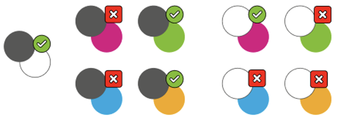
It is worth considering, as with the diagram above, that certain colour combinations within your existing guidelines might be fine, but some might not pass online accessibility testing. This should be made clear in your guidelines. In this case you might not need to change any colours, but just pick combinations carefully. A good tool to check colour combination accessibility is this one from Use All Five.
By making your brand colours more accessible, you are being inclusive and opening up your brand to a wider audience, potentially increasing your customer base. Win-win.
Typefaces
First off, a couple of definitions. When we say ‘typefaces’ we mean a family of fonts, which might come with a name like ‘Arial’. Arial has a number of styles which vary in weight and size. When we say ‘fonts’, we refer to those different styles, for example, ‘Arial black’ or ‘Arial narrow’.
Specificities aside, a lot of your website will be words – those words need to be readable whilst harmoniously representing your brand.
Does your font work online?
Back when the internet was getting started we were limited on what words looked like as we had to rely on a small set of typefaces. This meant compromise (and a fair amount of Comic Sans) for most brands. Nowadays, you can have a beautiful typeface sensitively chosen to articulate your unique tone of voice and this can be represented using a webfont. Additionally, services like Google Fonts can offer, if not your exact font, a close approximation. When considering your brand online, check if your typeface has a webfont available or that you have a suitable online alternative.
Visual hierarchy
As mobile usage increases, it comes with a challenge for how readable text is across all devices. We suggest choosing your typography based on two things: readability and versatility. Your headlines and body copy should be easy to read on both digital and print materials. And you should have a few different sizes/weights of your typeface that you can use for different purposes (like headlines, captions, and pull quotes, as demonstrated in this article!).
To create accessible pages it is important that we use a strict page structure, identifying headings and body copy individually. Headings should be styled differently to the body and the smallest heading should ideally not be smaller than the base body copy. Careful planning will ensure that you have a consistent look across all devices.
Long story short
You may have spotted online the trend of large dense paragraphs being overtaken by short scannable chunks. But equally important is characters per line and space between those lines. There is a general typographic rule that your text should have a line length of 45 – 90 characters per line.
Where your brand may have denser line spacing offline it is worth considering how users will read online and creating more space between lines. The W3C who develop accessibility guidelines online, suggest that your line spacing should be at least a space-and-a-half within paragraphs.
So remember, when developing your charity branding guidelines, consideration should be given to how pages of type will look online for maximum readability.
Logo
Your logo is the label that makes something yours – that cherished mark that should appear on everything you do. It’s your Swoosh, Golden Arches or piece of fruit. Whatever it is, you need to ensure that it is instantly recognisable as it is the one piece of brand identity that has the power to assure the user that they have come to the right place.
Squeezing into small spaces
With mobile being the first port of call for many users, there comes a squeeze on the amount of space that is available for those more complicated logos. Often brand guidelines will specify a minimum size and spacing for a logo but in reality when we get down to mobile it becomes a sacrifice of space vs legibility. One way around this is to have a reduced logo for very small spaces as in the social media examples below. This will also help when producing a favicon, which is the tiny logo symbol that appears on tabs and bookmarks in your internet browser.

Is your logo available as an SVG?
SV whaaa? Sounds complex but a Scalable Vector Graphic (SVG) is a file format that allows for your logo to look crisp and clean whether scaling up or down. This might not be an option for really complex logos but for most, it is the best way to ensure that visually the logo remains super sharp across all devices. Ask your branding agency if they can export your logo(s) as SVG and you can be assured that no matter the size your logo will look as sharp as James Bond in a tuxedo.
Imagery
Good imagery should be about telling a story, rather than just filling up blank space, and should go hand in hand with your organisation’s tone of voice. One of the most common issues we run into when designing a site is that the client doesn’t have sufficient high-quality images.
The reality is that most websites will need at least one image per page and for most organisations that is between 10 and 50 images, increasing as your site grows. The following are some things to consider.
Image bank
Building up a large bank of imagery is key to having a varied, harmonious and visually impactful range of photography and/or illustration on a website. To keep your website looking fresh, images need to be changed regularly. Without an image bank, users may seek out images that don’t represent the brand or tone. Building a deep image bank should be part of an ongoing content strategy that looks at the website as a living project, constantly evolving to user and organisational needs. Consider whether there is an ongoing budget for photography shoots, commissioned artwork, or stock photography to ensure consistency. Try to set some guidelines around what imagery is and isn’t acceptable. A great resource for completely free imagery is Unsplash and you can set up your own collections on their platform with good examples that your teams can use at no cost.

Image styling
Sometimes, we want to place text over images within a website. But how do we maintain legibility and accessibility standards? Plus, we want to keep the text ‘live’ rather than being part of the image, as it can then do all the fancy stuff, like be read by search engines and dynamically resize based on the user device.
For these reasons, it is worth considering the impact and implementation of text over the top of imagery. You might need to choose images that offer more ‘quiet space’ than you’d expect by looking at how it looks on a desktop webpage as it might differ on mobile. It may be that having text directly over an image is not workable online and another solution might be appropriate, for example having a colour block behind any text that sits on an image.
Conclusion
It might feel like you’re miles away from getting it all right, but as you can see, there are small steps you can take over time. Bit by bit, these steps will push your brand towards becoming truly digital-ready: able to adapt to evolving technology and ever-changing user needs.
Ideally as part of a long-term branding plan there should be a digital brand guidelines tool (preferably online) that can be reviewed and refined.
While not everyone has the budget for these, here are some good examples from big brands:
But it’s not just for-profit companies that are smashing it with their brand guidelines. RNLI has a great digital booklet that you can download, which certainly takes a digital-first approach to their brand. Again, this type of in-depth booklet may not be within scope for your charity branding project, but creating a brand that’s digital-ready doesn’t need Audi or Slack’s budget.
We can learn from these big brands. You don’t need to spend an absolute fortune on your guidelines, you just have to know what to ask for at the right time – and hopefully, you’re more aware of what to ask for now.