5 ways to make your charity website mobile friendly
Charities are missing out on the mobile revolution. Our research shows that smartphone users are the biggest source of traffic to charity websites (68%) – yet the vast majority (79%) navigate away from the sites after viewing only one page.*
These ‘frequent but shallow’ visits mean most of your online audience is less likely to donate online, or engage with you in any depth. This could have lost the sector as much as £1.5bn in donations last year alone. As online mobile usage increases year on year, this problem will only get worse.
The good news is that an untapped audience of potential supporters lies easily within your reach.
Here are five things you can do to engage them.

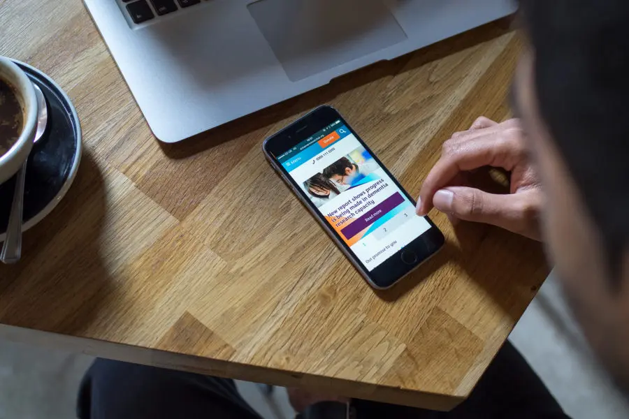
1. Make Content Easy to Scan
Consider how mobile users access your website – not with time to spare on the laptop at home, or fully focused in a quiet office, but in snatched moments on the bus, or sat on the sofa with half an eye on the TV, scrolling quickly with their touchscreens.
For such people, your web content needs to get the message across quickly and effectively. Be concise. Put the main points up-front. Use meaningful headings and bold text. Make it easy for mobile users to scan your pages to find the information they’re looking for, don’t craft a long winded narrative and try to force them to read it from start to end.
2. Make your Forms Mobile-friendly
Most of your customers engage online via forms – to donate, sign up for events, subscribe to newsletters, etc. These can be tricky to fill out on a small screen.
Simply the process by asking for the minimum data that you need. Add metadata – a type of hidden clue about the purpose of a form field – to enable the auto fill-in of details such as name, address, credit card information, etc.
Enable Apple Pay and Android Pay, which make giving donations super-easy at the touch of a fingerprint on the phone. Include styling elements that make entry boxes and buttons display in larger sizes on smaller screens.
3. Make the Most of Mobile-only Features
Mobiles might be limited on screen space, but they also have a few tricks that a desktop can’t emulate.
Phone numbers, if set up correctly, can be tapped to make an instant call from a mobile device, just like email addresses can open up email software.
You can also add GPS to detect the user’s location and tailor content or maps. Social sharing is easier for users as they’re likely to be logged into their social apps on their device already.
4. Make it Quick
It’s not only mobile users that are time-poor, but also the phones themselves. The time it takes your website to load and render (i.e. go from being a stream of code to an image on your screen) strongly influences whether or not mobile users will stick with you. It even impacts on your Google rankings – only fast websites are now allowed to rise to the top of searches.
Big images and lots of page clutter are particularly problematic on slow, congested and expensive mobile internet connections. So think hard about what you include in your pages, and how much baggage your website places around your content.
5. Make your Website Responsive
If your website’s templates aren’t able to adapt to display properly on different devices, you may be alienating more than half of your website visitors. A responsive site will adapt the content for mobile screens, stopping users needing to pinch, zoom and scroll from left to right to read every sentence.
This does mean redesigning your website but the pay-off is a single site that adapts to fit any screen-size, and doesn’t need you keep a separate mobile site updated and maintained.
* We used Google Analytics to conduct our research into charity websites between 1 September 2016 and 31 August 2017.