The best charity websites
A breakdown of best practice in the world of charity websites.
Recently, BIMA released the report ‘Charities In Need 2020: The State Of Website Performance In The Third Sector’, an audit of 411 small and mid-sized charity websites. Its conclusion was sweeping, and fairly grim: that, when rated on best practice, only 2% of sites received ‘excellent,’ and 41% straight up failed.
While it’s easy to get bogged down by such stats, when it comes to charity websites, there are some beauties out there to behold and – more importantly – to experience. Although BIMA’s report excluded charities with an income of more than £10m, it’s worth noting that the beauties we speak of don’t all originate from the upper echelons of the charity world. Sure, a chunky budget might allow you to dream bigger, but if we’re talking about how accessible a website is, or the language and tone of voice used, money doesn’t necessarily come into it.
Here, we take a look at some of the best charity websites out there. Unlike other ‘best websites’ lists, each included website aligns to a different aspect of best practice. After all, charities’ goals are as individual and varied as the people they strive to help. So there’s no use in judging all charity websites under one umbrella.
Campaigns – Charity:water
The website for the international organisation charity:water is often found on ‘best charity websites’ lists and it’s not hard to see why. Their entire website focuses on striking and positive visuals, and seamlessly blends imagery and video for maximum emotive impact. What we really love about this site, though, is how effectively it acts as a vehicle for campaigns.

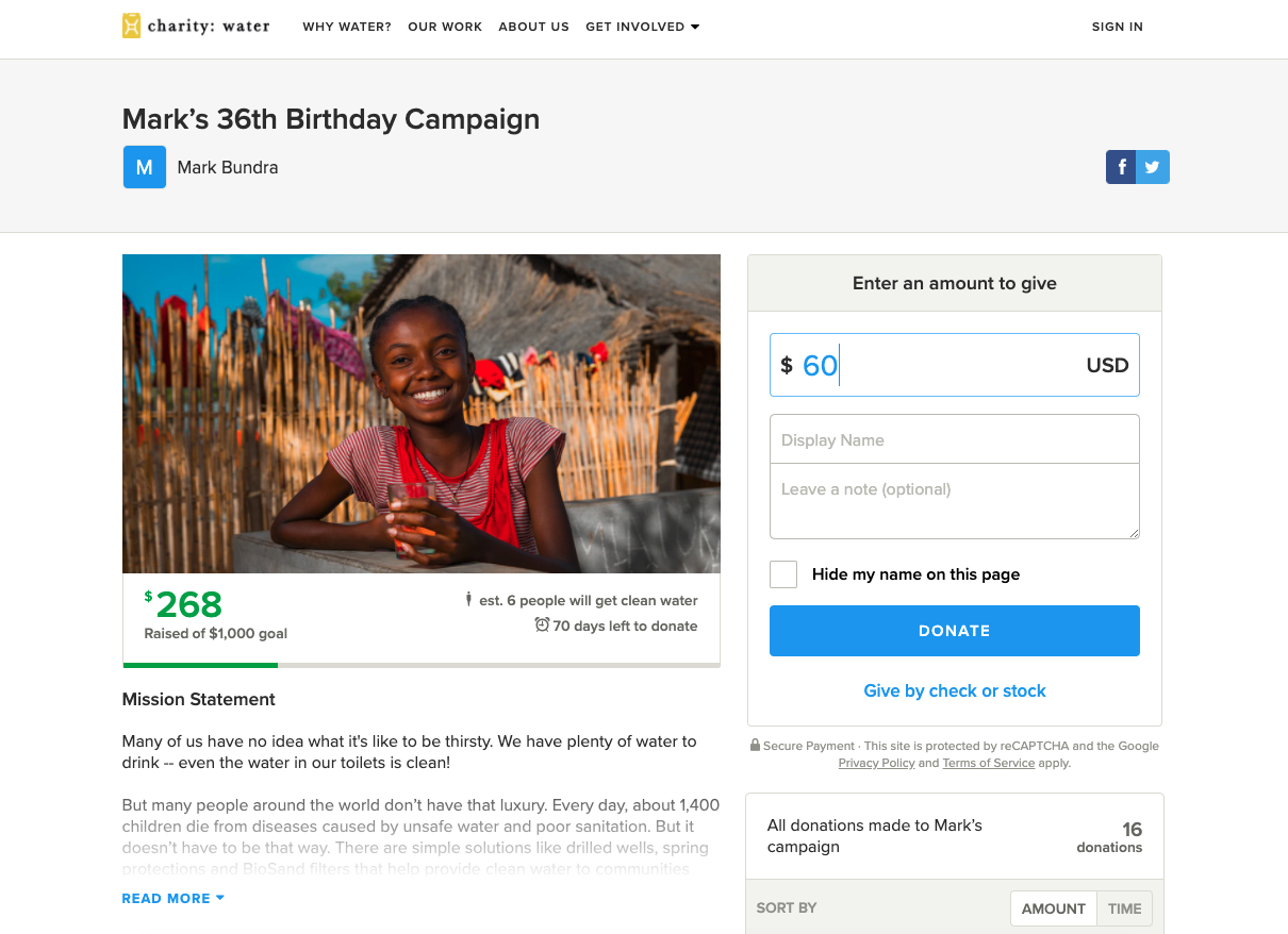
On current inspection, the ‘find a campaign’ section of the site contains five pages full of individual campaigns. It shows who has donated and how close to the goal the fundraiser is. There is a nice touch of including how many people will access clean water thanks to each campaign: acting as a motivation to give money, or showing your impact if you already have.
The step-by-step guide to fundraising on their website provides a hassle-free and accessible starting point. Our favourite section has to be their unforgettable campaigns section; Lilibet is an inspiration to us all!

Overall, the charity:water approach to campaigning is an unstoppable force; the proof is in the pudding as their US site has amassed over $57.5million from over 70,000 campaigns. Never underestimate the power of individuals (and a seamless campaign experience, of course).
Accessibility – Scope
Scope re-test for accessibility every three months and their website goes above and beyond the basic colour contrast/screen reader usability that most of us associate with ‘accessibility’. They even publish known problems with their site’s current accessibility and outline transparent plans to fix them.

Scope has clearly put a lot of effort and time into full accessibility on their website, going further than the quick-fix gesture of putting a toolbar at the top of the screen. With these accessibility toolbars, “If it sounds too good to be true, it probably is”. The goal for your charity website should not be merely complying to WCAG guidelines, it should be to deliver a truly accessible, usable service for all – a feat Scope achieves with flying colours.
We love how easily navigable it is by keyboard for people who experience difficulty when using a mouse. A quick press of the Tab button will send users straight to the top of the page where Scope have added a few shortcut links, meaning keyboard navigators can cut out how many times they need to press Tab to get where they want. These shortcuts include: skip to main content, skip to navigation, skip to search, and skip to Coronavirus info. Their use of focus states which glide across the page is top-notch, ensuring the user is aware of what element of the website they are on and which link they’re about to click.
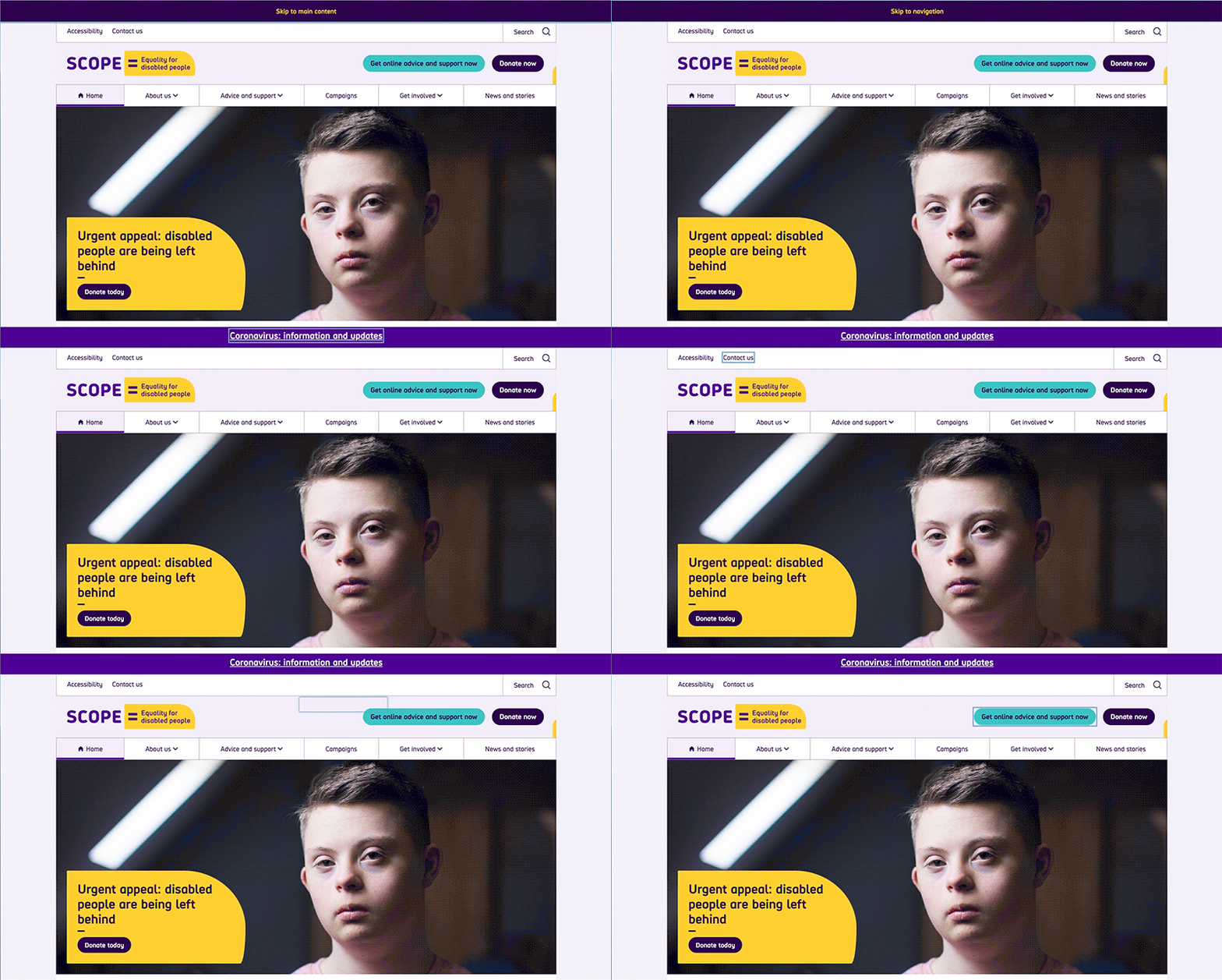
To top it off, Scope’s website colours are bold and contrasting. The site is full of clear, unambiguous user journeys, inclusive language and simple calls to action.
Delivering information – Liberty
Advocacy group Liberty provides legal advice and information on Human Rights, a topic so extensive and essential that it can’t be covered in a couple of webpages. The density and depth of Human Rights law makes it an inherently inaccessible topic and so often, it is the people who need the support or advice the most, that are likely to find it challenging to understand.
People will often land on Liberty’s website in a state of confusion or distress, searching for information on a human rights issue they’re facing or are passionate about. This means that Liberty’s website cannot afford to intensify that confusion with unconscious barriers.
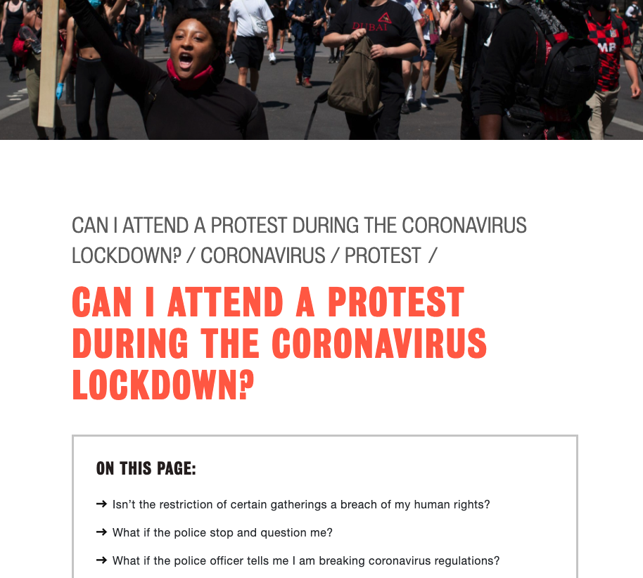

The content structure of Liberty’s site is effectively clear and logical. Complex topics are made simpler through use of a filter, and once on a page, the viewer is greeted with an initial summary of what that page covers. This saves both time and energy and prevents anyone combing through content that won’t be useful for them. By providing a uniform structure, users quickly become familiar with the format, enabling them to quickly understand how and where to find the information they need. The structure also encourages exploration, by providing easy navigation through related content links.
Donation journey – Young Lives vs Cancer
When donors decide to give money to young people’s cancer charity Young Lives vs Cancer, they are immediately met with large, emotive photos of real people that their money will help. This imagery follows the donor through each stage of their donation journey, willing them to continue. This, coupled with encouraging buttons like ‘Almost there!’ gently push people in the right direction to complete their donations.

The donation page is clear and informative; it explains to donors about the specific impact their money will have on a person’s life, and provides clear explanations around what Gift Aid is and how it impacts the final donation amount.
Payment options are efficient and varied, giving donors the option to give through Paypal or to skip the form altogether by donating through text. And finally, Young Lives vs Cancer makes donations meaningful for the individual that is giving, by providing the option to donate money in honour of someone. This extra, emotional touch is a lovely way to make a donation represent just that little bit more.
Great donation journeys are reliable, and Young Lives vs Cancer donors will give money through a truly robust system. Why? Because it’s actually a separate, integrated application dedicated to taking donations. With it being a dedicated service, it’s easier to use the widget on different parts of the main site. This separation gives the donation journey protection from any of the main website’s potential issues. If the main site goes down, the donation form will remain unaffected.
Tone of voice – Bloody Good Period
A bold and clever name for period poverty charity Bloody Good Period lends itself to an equally bold and tongue-in-cheek tone of voice which features highlights such as, “Join the bloody mailing list already!”. Their refreshingly frank, courageous, and rightly shame-free language goes hand in hand with one of their missions: to help everyone talk about periods.
Bloody Good Period’s Instagram presence is truly something to behold, and whilst we wouldn’t ordinarily recommend a social feed being included on a website, it totally works in this case. The inclusion of a fun and bold Insta feed on the homepage next to the phrase “Be a #Bloody babe and follow us on Instagram” shows that they know where their target audience hangs out online, and actively encourages them to follow the charity on a super-relevant platform, with language that speaks to them like a friend.

Simple navigation – Terrence Higgins Trust
When people land on the website for the UK’s leading HIV and sexual health charity, they often need help or advice – fast. Users are immediately met with a big search bar, and three blocks of important service links. The first link “Have you taken a risk?” provides no-nonsense navigation for people who may be experiencing anxiety about their personal situation and are looking for urgent help.

The overall site is minimalistic and simple in its navigation with a focus on functionality and the effective delivery of services, whether online or in-person. A search bar and ‘Speak to somebody’ button follow the user round the site at the top of the page; if at any point they can’t find what they’re looking for the option is there to search in their own words or get direct help.
Amazing imagery – National Trust
After almost a year of being cooped up inside the same four walls, looking at the expansive natural scenery featured on the National Trust website is almost transcendental at this point.
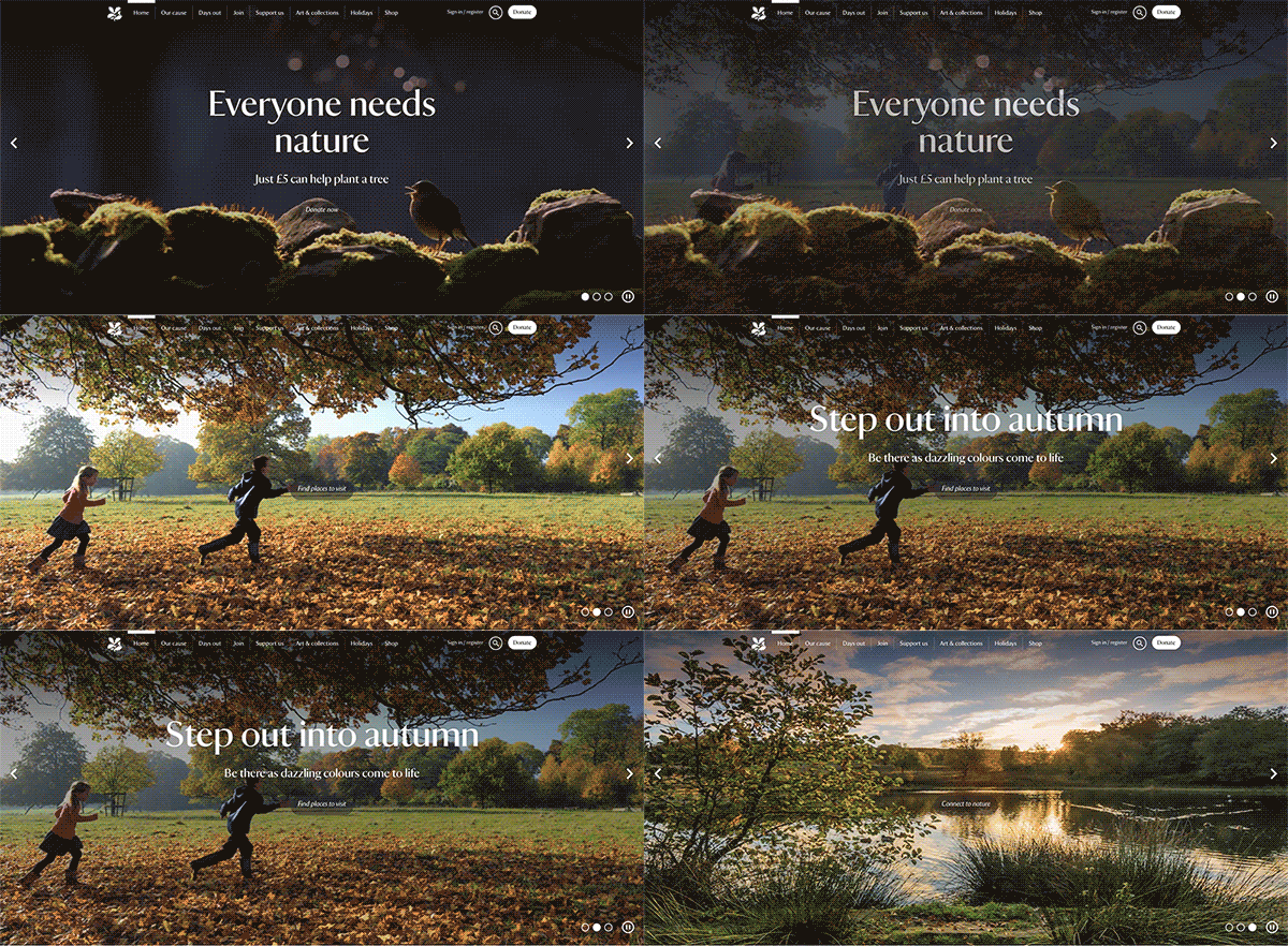
And that’s their aim. You can write all you want about how beautifully unrivalled the National Trust locations are but text just doesn’t do it justice. Therefore the website relies heavily on large, lush photographs that inspire: the will to donate and preserve these landscapes, the decision to buy a membership, or the motivation to get out and experience that beauty in person.
Not everyone is as lucky as the National Trust to have such a picturesque charity mission, but we can all learn something from their strategic use of visuals: no photo is just thrown on to the site, instead each impactful image is thoughtfully selected and placed to represent a mission, elicit an emotion, or to inspire action from visitors.

Clear call to action: Baggy Trousers
A charity website, especially one providing health information, needs to have clear and distinct calls to action on its homepage. Testicular cancer charity Baggy Trousers tackles its subject matter in a refreshing, and lighthearted way. The quirky homepage is no different and is an awesome example of a website with an unforgettable call to action.
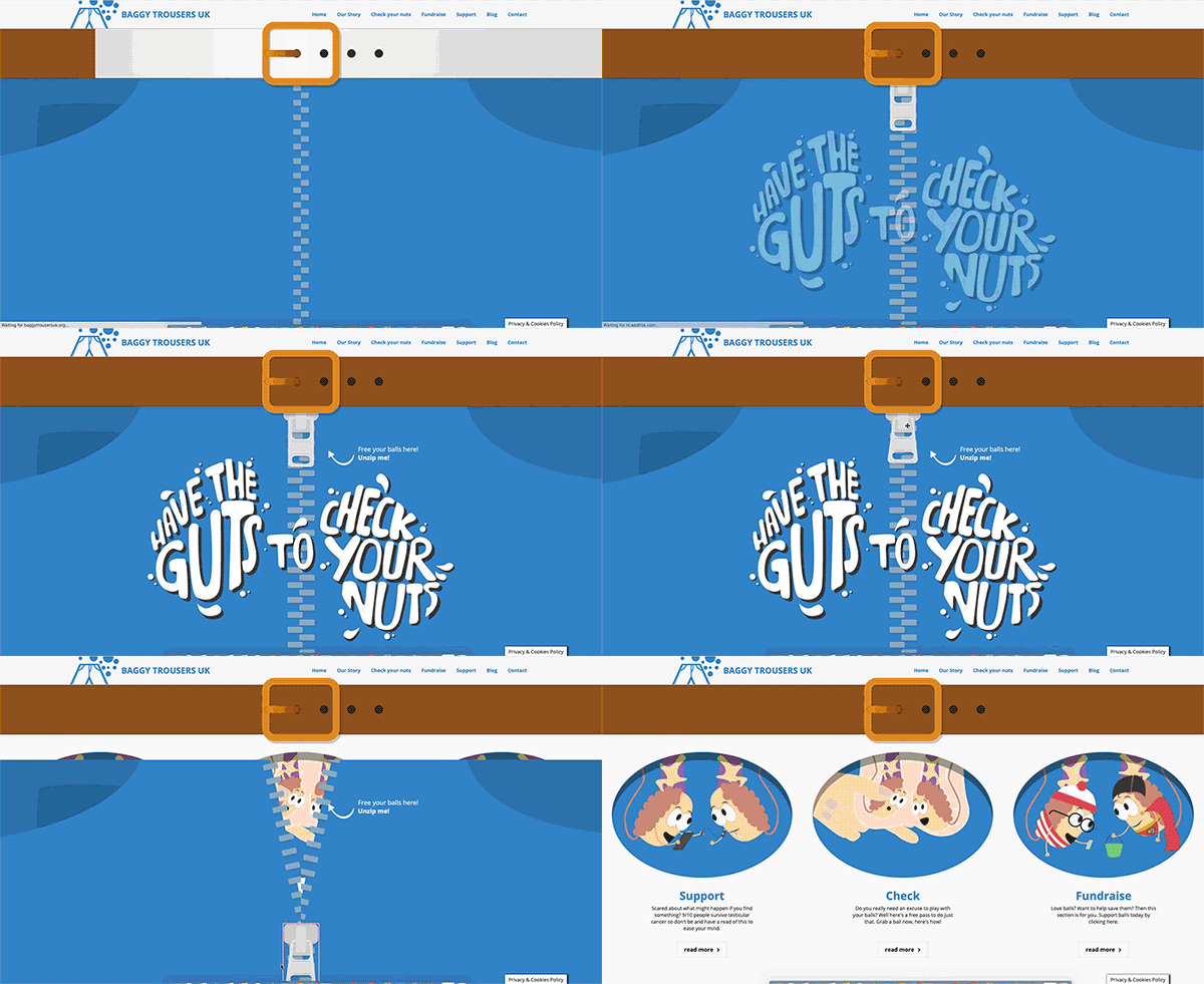
The homepage experience engages users right off the bat, and works just as well on mobile as it does on desktop. Jack Broadley, founder of Baggy Trousers UK, told us that Google Analytics revealed the main reason for folk to visit the website was for advice and guidance on checking themselves. If you’re in that place, you may feel anxious or hesitant to start the process of checking, so the site has to inspire confidence and break down barriers from the get go; it couldn’t afford to be tedious, clinical, or off-putting in any way.
The main call to action, ‘Check’ is front and centre just as soon as you unzip the virtual trousers (why the hell not?!). This keeps the number of steps to a minimum for users trying to understand how they should be checking themselves. Additionally, a similarly quirky ‘Donate’ button follows you round the desktop homepage, ensuring you’ve always got sight of the call to action whilst reinforcing the tone-of-voice the charity so boldly inhabits.

Stay tuned
These eight stellar examples of best practice are just a slice of what the sector has to offer.
Right now, your charity’s digital channels need to work harder than ever – especially your website. Stay tuned in the coming weeks for a follow up, with best practice tips and guidance on how you can take inspiration from these organisations to improve your own charity’s site, and maximise your online value.
🗣️ What did you think of the list? Do you have a favourite charity website you think deserves to be up here? Let us know on Twitter @ReasonDigital!
