The Annual Report of the Future
Want to do something different with your annual report? Here are 10 things that will shape the way the next generation of reports as they move from paper documents to fully-fledged digital experiences.
See these ideas as a list of ingredients to spice up your annual report. To make it stand out from the competition in an age that’s being shaped by digital – not paper – communication.
1) Un-annual
The web means it’s quicker and easier to update information gradually, rather than have a big push once a year.
Think about how you could re-write and refresh a chapter in your annual report each month, or how data tables, charts and lists of case studies could update automatically from your service delivery, CRM or other IT systems.
It’ll make you feel more current, more live and more impactful – not just be less of a nightmare to compile each year.
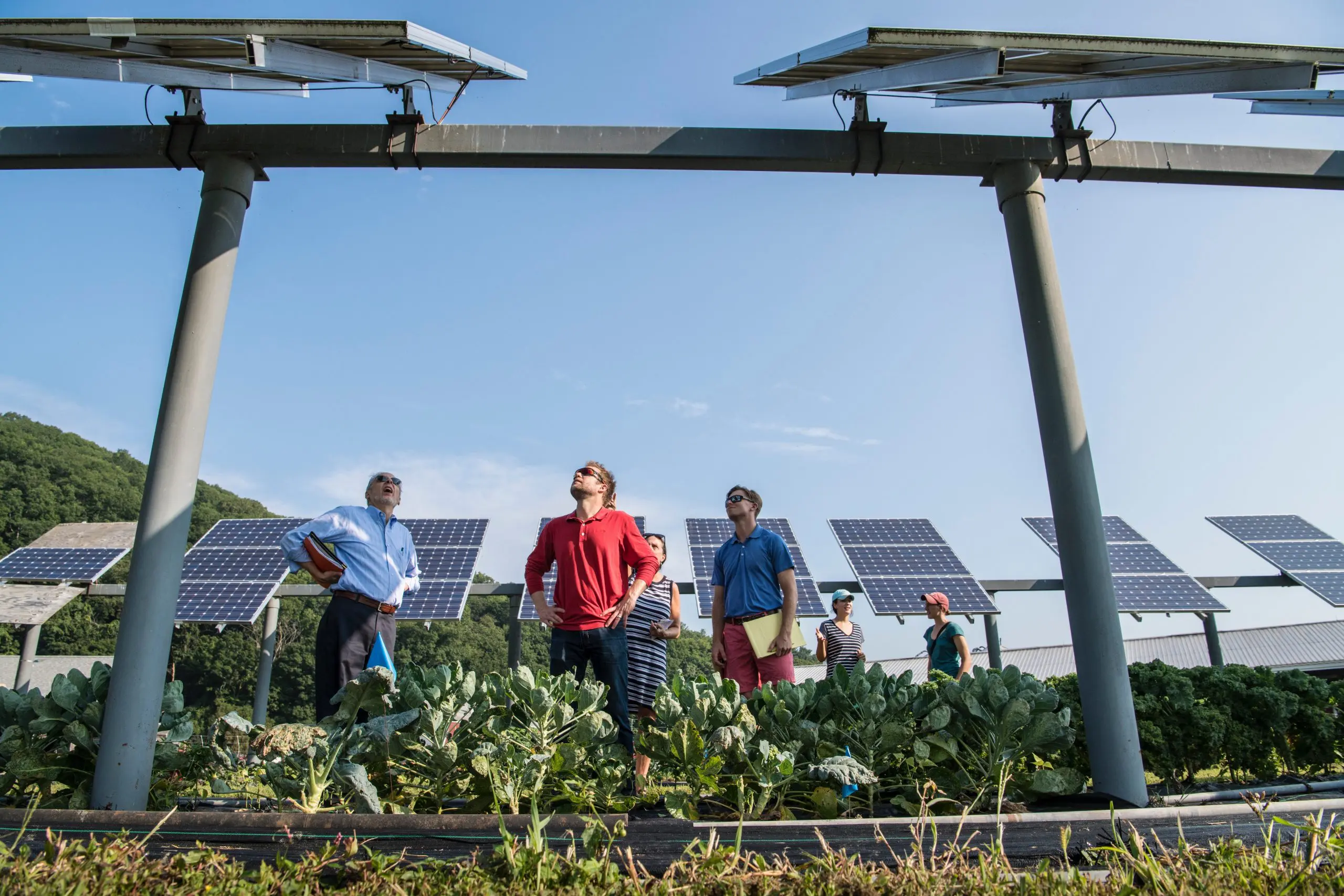
If you want to be really extreme, why not provide a snapshot of impact to date, or as it stood on a particular day, using graphs showing progress over time, or timelines showing projects and achievements by date.
2) Not a report
When you start to think of your report in real-time instead of a retroactive annual write up, you’ll start wondering why it should be a “report” at all.
Instead of printing your report on paper and offering a tokenistic, clumsy PDF download, think about what it could be if it was digital first: a section of your website that’s kept up-to-date like any other, a slick online presentation, or even something that’s spread into the fabric of many sections on your website – without outcomes stats on the relevant project and service pages.
Web pages will make your report more accessible to disabled users too, who will be able to browse it using assistive technologies like screen readers. It’ll help search engines find and index your content. And the savings in stacks of paper reports will give your environmental stats a boost too.
And while you consider points one and two, why not ditch the term ‘annual report’ altogether? Google went with ‘Year in Search’ and, Facebook and Tumblr both chose ‘Year in Review’. These titles hint at a broader, more interesting read.

3) On any screen
Once your report is digital, it can work on any screen – especially if it’s designed ‘responsively’.
Your staff could read it on the way into work on their smartphones, the board can go over it in depth on a tablet at the trustee meeting, your funders can review it on their desktop PCs.
Plus, if you’ve taken the leap to replacing static graphs and stats with live data then you can tap into a powerful motivator for staff.
Display the report full-screen on a TV monitor or projector in the office and see how your team discusses how to beat last week’s helpline targets, instead of letting things slip and reading a report next year when it’s too late to do anything about it.
4) Multimedia
Paper may be easier on the eye, but screens have their advantages too.
They unlock the use of multimedia to enrich the emotional punch of the narratives in your report. Slideshows explaining the transformation of a regeneration site, an audio recording of a helpline session, a video interview with a happy service user.
Animated infographics – moving graphs, charts and illustrations that communicate a statistical narrative – provide a more innovative way to highlight the facts and figures, too.
Imagine the extra impact of the message from the Chief Exec when you can watch her say it; intercut with footage, photographs, animated infographics or charts to bring to life the key points she’s making.
Think about how your report can be watchable, listenable, glanceable, as well as just readable.
5) Interactive
The internet is a lean-forward, not a lean-back medium meaning people are engaged, interact and actively seek out information instead of passively receiving information, like they do from TV. People click around what interests them, they want to create their own narratives by exploring the issues that matter to them.
Instead of trying to force them to read our report from start to finish, we should embrace people’s desire to explore. Give them the option to go as deep as they want into a section that interests them, highlighting the cliff notes at the top level of sections they’re just curious about.
Slideshows, interactive charts, photos with clickable hotspots, maps highlighting clickable locations of active projects with pop-ups, video interviews with a bank of pre-recorded clickable responses to questions, all provide an innovative way for users to interact with the content in the report and drive their own experience.
6) Personal
Companies are increasingly using the data they hold on us to personalise the experience we have on their online shop, loan and betting websites.
If your site has a log-in, or you’re emailing someone a special link to view the report, you can tailor what they see in that report automatically.
You could switch the focus of the report to highlight more of the volunteer, service user or funder-centric information, depending on the audience.
If you have good records linked to an email address and, for example, you know how much a donor or volunteer has given that year, you can present their impact in terms of their individual contribution. Tell them if they were a higher than average contributor, tell them their donation meant we could help three children, etc.
Sensors in tablets and smartphones provide even more opportunities. For example, GPS and geolocation means you can highlight impact in the location of the reader – this is powerful given how many donors cite local impact as a primary factor in their decision about their charity giving mix.
Of course, you might only use this to tailor the message for one person – giving a rosy spin on just about everything if you detect that it’s the CEO’s computer accessing the report!
7) Social
It’s likely that many of your staff and volunteers are keeping a constant conversation going on social networks.
Service users and supporters are constantly reporting on their views and experiences of your organisation using these networks, too.
Consider what contributions – such a set of ad-hoc, genuine voices and testimonials – can make to your report. Many social networks allow you to embed posts, such as a tweet, an Instagram image, a Vine video, and more, into a web page. Tools like Storify take it further by letting you drag and drop messages from multiple networks into a single embeddable story on the page. It’s great for showing what happened at big events through the eyes of the participants.
Reports can also encourage new social media activity, and new conversations to happen. Giving people the buttons – and the nudges – to share a page of the report, or leave a comment on a section to give their view, is not only a good way to get more readers, but it also brings your reader to life, giving you an insight into how your report is being perceived by your audience, as it happens.

8) Open
Not only are online readers used to driving their own journeys through information, they’re increasingly used to deriving their own meaning and conclusion from the raw information.
The data you derive your stats, graphs and infographics from can be made downloadable so others can combine with other datasets to help better understand social problems and interventions.
Sites like the Guardian’s Data Blog show how the information on the needs, work and outcomes of activities can be worth more together – mashing up information on, for example, economic deprivation vs. food bank usage on a map.
The benefits of that have to be worth the slight terror of having someone else check your facts!
9) Connected
Your report is just a single perspective in a vast sea of online information.
Consider connecting other resources into your report, by linking to partner agency websites, academic reports and press write-ups to support your points.
Why not pull-in a widget from the charity commission, showing your accounts in their standard format, or your Fundraising Standards Board membership information showing exactly how spick-and-span your complaints return history is.
This could even go further, thanks to the web. Trying to save your social housing tenants money on their energy bills? Connected smart meters could report their energy usage in real-time straight into your report.
10) Embedded
It seems inevitable that once you consider your report a series of regularly updated chunks of information, that it will gradually become embedded as part of your website and ecommunications, not a separate PDF, microsite or download..
The work you put in to that report can enrich and keep current content elsewhere on your site, instead of being a silo. Why shouldn’t an inspirational, multimedia case study from a service user find its way onto the service page it relates to, or your financial efficiency results not go into your potential donor Q&A?
To get really futuristic, you could even consider how the report can be embedded in the built environment? Physical installations, screens and visualisations in your reception showing this month’s number of saved lives, or pounds raised through fundraising activities could inspire your staff to make a bigger difference each day.
What comes next?
Maybe the dear, old annual report is doomed to disappear in the end.
Yet the principles of solid, regular and strategic reporting of the position of your organisation will always be relevant. We owe it to our organisations to use the best tools for the job and it just doesn’t get any better than digital.