
Five brilliant ways to report your impact
Charity work can be dramatic and life-changing, but when it's annual report time, achievements can get lost in numbers, tables and jargon.
Some charities are leading the way when it comes to shouting about their impact, and they do it new ways that their supporters, funders and service users find engaging and compelling.
Here are five great examples of effective ways to report your impact…
Dog’s Trust
For their 2011 Annual Review, the dogs trust took on a fun and creative school report theme – complete with sections like Mathematics, Biology and PE. The report mixes humour, original photography and quirky facts between the usual project summaries and numbers. It makes for an engaging read for anyone interested in dogs, not just those interested in the Dog’s Trust.

Clear, bold and adorable
This doesn’t mean the report’s short on numbers. Bold, and clearly laid out statistics are littered throughout the report covering everything from the average costs of caring for a dog, to a breakdown of all of the media work the Trust’s been engaged with.
Other nice touches include a ‘head dogs’ and ‘alumni’ section showing through playful photography some of the happy, healthy beneficiaries of the Trust’s work.
BBC Outreach
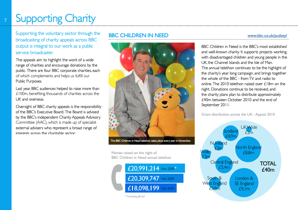
Reporting the social impact of largest broadcaster in the world is no easy task. Not only are there millions of beneficiaries, and hundreds of projects… but there’s also the huge demand for copies of the report itself to deal with.
Naturally, the BBC has keen environmental and financial targets too. Producing and distributing tens of thousands of glossy copies of a 50 page report wouldn’t help those much.
That’s why 3 years ago the BBC took the bold step to make their CSR report digital only. Summaries of all the key facts and reports are available on their website, categorised by theme at bbc.co.uk/outreach. Readers interested in the full facts can download a PDF report, in landscape for easy screen reading, with a clickable table of contents. It’s fully printable on home printers for readers that still prefer a paper copy, but at their own expense.
This year’s report is as much about data as it is about project reports. Rather than using tables to communicate sets of numbers, each project has a unique graph or infographic designed to highlight the impact of the numbers at a glance. This variety also helps make what could have been a very dull looking report visually exciting.


charity:water
Numbers can really simplify huge problems or huge amounts of work. One of the things they aren’t so great at, however, is scale. Take, for instance, the number 483. This happens to be the number of projects charity:water have completed in Liberia. When seen as a number it is impressive, but still somewhat difficult to picture. But by drawing out an icon for each project, the full scale of what charity:water have achieved becomes much clearer.

An impact on site
Where charity:water really excel though, is not their PDF report, but in their website. Almost all of their digital communications are bursting with impact. Videos describe their goal, pictures show you their effect on the cause and text tells stories of those they have helped.
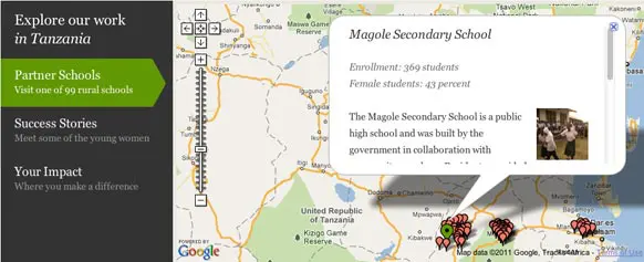
Camfed
Since 1993, Camfed has been working in Africa to try and educate young women. They work in countries that have a combined landmass of nearly 2.5 million sq km and are trying to fund 1,103 schools. As such it’s easy to imagine their website as an impenetrable wall of lists and tables, but Camfed found an elegant solution – an interactive map. This simple map condenses a lot of data into a simple, easier to navigate and, most importantly, more interesting interface. Scrolling across a map of Zimbabwe is a lot more engaging than scrolling through tables of dozens of new school names.
The rest of the Camfed website uses simple visualisations of information, and bold statistics to quickly communicate not only the impact they have, but the problem they’re addressing. It’s a great example of how a website can be an ongoing, living testament to your impact.
NSPCC
When it comes to communicating your results, one of the most important things is relevancy to the reader. Not many people will wade through hundreds of irrelevant case studies, project reports and statistics just to find the one they were looking for. This can be a big problem if your charity has a diverse outlook.

Customisable
The NSPCC sidestepped this problem with their online annual report. Not only is it beautifully presented on their website without the need for a PDF download, but it also allows the users to fully customise it for their purpose, downloading a copy with just the information they need.
Like the other reports featured, attractive uses of numbers, visualisations and photographs are mixed to best communicate the impact the NSPCC has had.
Communicating your impact is one of the most vital piece of comms any socially motivated organisation can do. Traditionally the only way it had been possible was with a printed annual report, but the internet has made it easy to get your accomplishments heard all year round. An online report is a more convenient, effective and cost effective approach. With an intelligent use of multimedia such as video, photography and statistics you can also make your reports a lot more engaging than you can with just paper and ink.