Refuge
Survivors pave the way for the digital future of domestic abuse and violence support.
TW: domestic abuse and violence.
If experiencing domestic abuse or violence, a ‘place to go’ is a potentially life-saving prospect. And yet as a woman in crisis, places that should feel the safest, such as family or the police, aren’t always set up to provide the right type of protection or support.
The police denied that I called them, even though I called them three times in two months.
Domestic abuse charity, Refuge, is an essential safe place for women in crisis, as well as a long-term support system. Initial contact with Refuge often begins with a phone or a laptop, and a website. So, as unremarkable as a website may seem these days, for charities like Refuge, it has become a trusted place and a digital shelter that saves and changes lives.
I thought it was just about ‘giving refuge’, but I realise now it’s about recovering from that experience too.
A national domestic abuse crisis
Making the initial call is the most challenging.
Since the pandemic, when the world saw a spike in domestic abuse cases with calls to Refuge’s National Helpline increasing by a drastic 61%, Refuge’s digital services across their three websites have also become indispensable in the fight against domestic abuse.
“We went from around 10,500 visits per month in the first three months of 2020, to an average of 73,595 per month between April 2020 – February 2021 – a seven-fold increase.” Refuge’s National Domestic Abuse Helpline website | Service Review | 2020/21
Media attention and donations accelerated simultaneously. Initially, Refuge focused on refreshing their social media and growing the email database, hoping to mobilise the increased number of supporters and drive change. But once those wheels were turning, the focus switched to a new website – a new ‘place to go’ – one that protects women in crisis, further mobilises potential supporters, and capitalises on fundraising opportunities. And we are proud to be the ones who helped.


Coming back to give back
Refuge saved my life, so I want to give back.
Firstly, we needed to understand who uses the Refuge website, outside of women in crisis. So we asked, “who are Refuge’s supporters?”
Turns out, the answer links directly to the impact that Refuge has on its service users. 54% of Refuge’s supporters are personally connected to domestic abuse, and 75% of community and events support comes directly from survivors. It’s evident: of those who have been helped by Refuge, the majority want to return that help.
Behind these statistics is a huge amount of passion from survivors to support others who were going through the same experience. For them, it feels like helping others recover from the experience of domestic abuse can aid their own recovery. We took this as our cue to design the website ‘survivor-first’.
For our UX team, that meant designing a simple, safe and supportive website experience. Yet, we recognised that the journeys of those who have experienced domestic abuse are complex.
I left for 2 weeks. Started getting calls from his [my abuser’s] mother and everyone else he knows. He was threatening her, saying he would kill himself. His mother told me I was destroying his future. So I went back to him.
Whilst there are common themes, there are varying degrees of manipulation, abuse, recency and entanglement – not just between two people, but between parents, children, family and friends. Each story deserves respect and understanding. We needed to dig in order to learn but couldn’t risk retraumatizing survivors – a very real possibility if using research techniques which don’t adopt trauma-informed ethics and approaches.
Trauma informed research
I become anxious if out late at night on my own, on my own in remote places. Once you have experienced thinking you are going to die, and the power of a man, that stays with you forever.
Fortunately, our trauma-informed research process meant that survivors could safely tell their story and input into the design of the new website, knowing that research activities had been planned to mitigate re-traumatisation, with safeguarding measures in place (for both participants and our own team).
Throughout all in-depth interviews, we maintained full transparency with participants, including a review of consent, clarity on where this information would go and a full script review with Refuge’s ‘Survivor Voice’ team before interviews commenced. Participants could stop or withdraw at any time during the process and our research team at Reason was supported by a Mental Health First Aider post-interview if they felt it was needed.
Trauma-informed design in action
The fact they’ve [Refuge] thought to set up these safety things, not tracked, can’t be seen on browser history, shows they truly understand the cause and are thinking of all the possible ways to help.
Trauma-informed research feeds into trauma-informed design decisions. Our UX team considered the emotions, fears and needs of those women through each step of their digital journey from their initial contact with Refuge, to their potential return experience as a supporter. We also listened to the stories of family and friends to inform the areas of the site that speak directly to them.
People have different needs depending on circumstance, and this was reflected in the stories we heard. While we don’t all have accessibility requirements all the time, we might need to use glasses later in the day when we’re tired, for example. Similarly, we might find it difficult to walk for a while after an injury.
In the same way, someone experiencing extreme anxiety will find it difficult to process information quickly. In their situation, lots of imagery and heavy blocks of text are extra difficult to understand. By prioritising women in crisis in particular, we made design choices that would make the site easier for everyone to use:
- Pages aimed at women in crisis don’t contain images. Women landing on these pages are likely to be under time pressure, for example, looking for information quickly whilst hiding in the bathroom. Scrolling through images slows the process down – particularly on mobile – so this is something we wanted to avoid.
- We were careful with the use of colour on text because on crisis pages, it became too distracting. Instead, colours were used to prioritise calls to action on other areas of the site including donations and email sign ups.
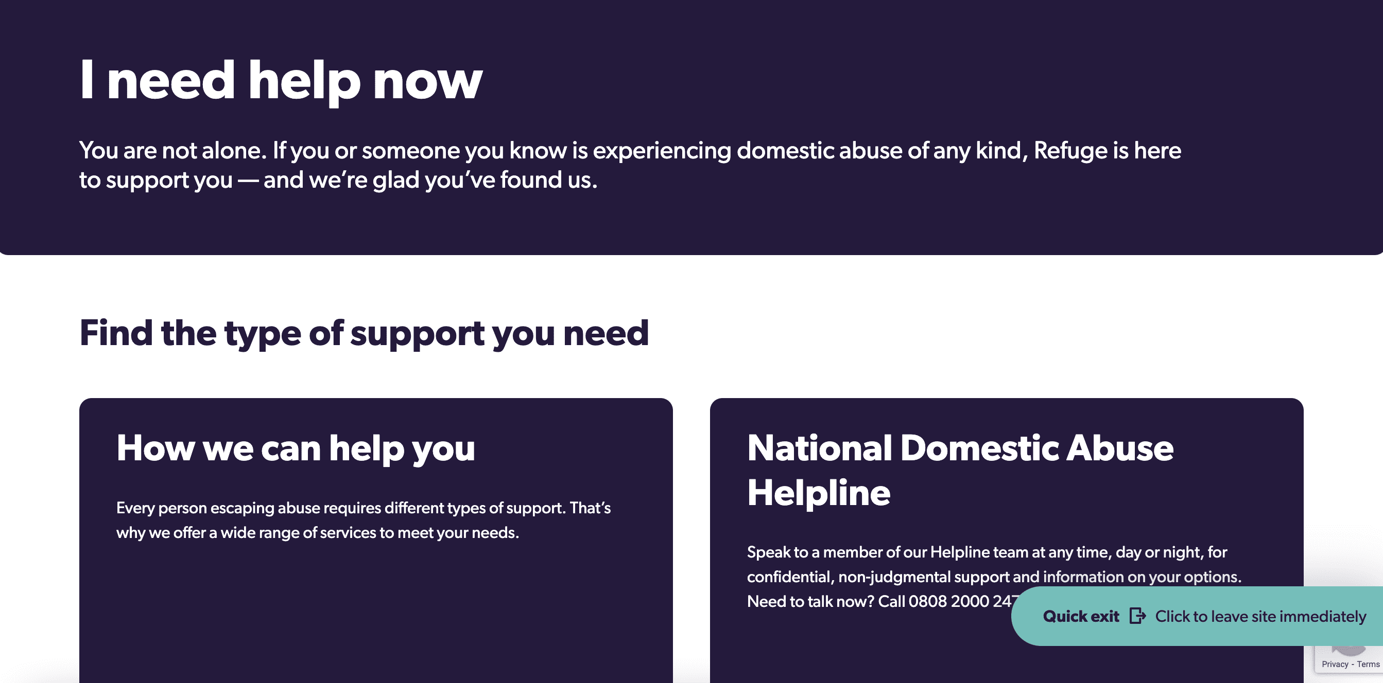
- An escape/hide website button wasn’t a new addition to the site, but our conversations with survivors confirmed the importance of its presence across every page on the site. We made sure to keep it visually similar to the exit button on Refuge’s National Domestic Abuse Helpline site and Tech Safety site, to provide an air of familiarity and safety.

'Escape and hide’ is crucial, and so is the helpline.
- The helpline number (National Domestic Abuse Helpline) is highlighted by its own shade of blue. By not using this colour anywhere else on the site, it draws the user’s attention straight to it, making it easily accessible and identifiable.
- Complex personal circumstances amongst users mean that Refuge caters to different scenarios – however, this can result in long pages with a lot of information. To ensure women can find the information they need quickly and easily, we created clickable section headers which are listed at the top of the page. The user can just click and go.
- The creation of an information hub for women in crisis to go to learn, validate their experiences and come to terms with the fact they may be being abused, before they’re ready to pick up the phone. This hub is made obvious and easily accessible in the main navigation bar with an information icon.
This user-centric approach has resulted in a number of survivor-driven, best practice design features which mean women in crisis can quickly and safely access life saving support.

Building a stronger digital refuge
Our new website will make it quicker and easier for women in crisis to find the help and information they need, and for people to learn more about domestic abuse and get involved in supporting Refuge on our mission to end domestic abuse.
To ensure the site’s future success, we will continue to be directed by user behaviour, focusing on how people are interacting with the new site. Our next focus is to improve the event sign up journey and add more information pages to more fully address the nuanced questions that women in crisis and the general public have.
The bottom line is that Refuge has a new website: a safe place on the internet which is in fact remarkable because it was born out of the real life experiences of survivors of domestic abuse, a place which takes into consideration their circumstances, emotions and fears during a time of crisis. For women who have come through the other side of domestic abuse and want to support the charity which saved them, they can do – easily and in any way they choose.
It’s been such a great experience working with Reason Digital right from the outset. Their values chime with Refuge’s, and this was one of the reasons we chose to partner with them. It has felt like a true partnership, we have worked as one team to launch this website. We’re really excited about the next phase!
Or, continue reading...
-

Battling bias in UX research
Let’s all start from an embarrassing truth: we all have biases. It’s not nice to think you’re part of the problem, and harder still if you’ve ever been marginalised yourself. What we can control is noticing the biases, reducing our reliance on them and not letting our own shame get in the way of improving.
-

Is This OK?
In 2013, the UK's ‘biggest child protection scandal’ began to unravel as the lid lifted on decades of organised child sexual exploitation in the north of England. The investigation was complex, but one thing was clear: the victims of these crimes felt unable to turn to the services that were put there to help them. That’s why, in 2016, a group of charities, changemakers and determined techies came together to create a new space where voices no longer felt they had to remain silent.
-

Radical Accessibility: Report and Recommendations
Access the must-read report which takes a deep dive into brand new data. How inclusive and accessible have charity digital services been during Covid? Find out here...


