The challenge
To overhaul an existing brand identity that had to work within the existing constraints of being affiliated with the Children’s University and The University of Manchester.
The result
A beautiful, accessible and modern brand identity, with bespoke typography that engages with a wide range of audience types.
The problem
The Children’s University of Manchester provides to the wider community, and particularly primary schools, a sense of excitement and knowledge, created through its pioneering research activities and teaching and learning practices.
Whilst appropriate for its time, their existing brand identity had aged poorly and struggled to engage with young people, or to compliment the University of Manchester brand.
The solution
We worked alongside the Children’s University of Manchester to better understand their audience and internal goals. Their existing brand used strong, sharp lines and a potentially overbearing colour scheme. It did not perform well on a variety of digital devices and the client felt that this did not provide a welcoming, inclusive environment for a digital disenfranchised audience of young people.


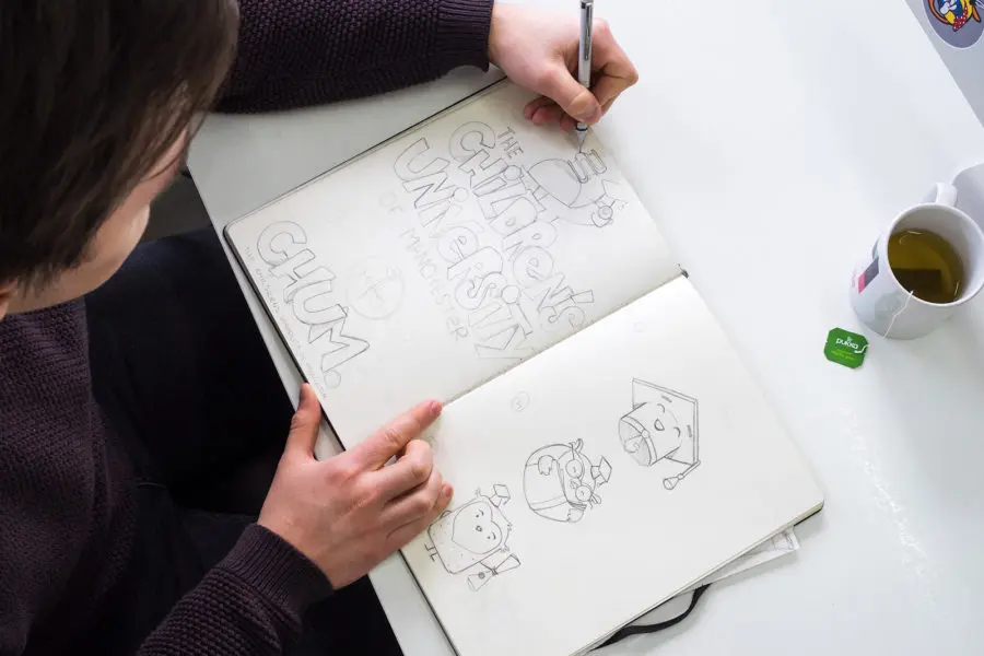
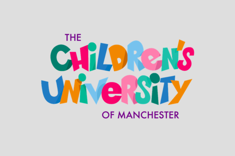
It was essential that the new brand identity be fun, and welcoming to new users, yet familiar for the existing audience base. Our design team created a bespoke typeface with joyful, soft and irregular lines, and a gentle colour palette.
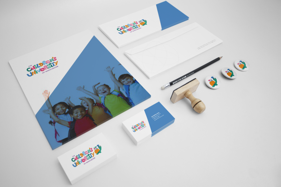
The brand identity needed to complement the existing catalogue of online activities and games and to sit comfortably within the University of Manchester brand guidelines, so we worked hard to ensure that all brand elements would work with legacy products and brand collateral.
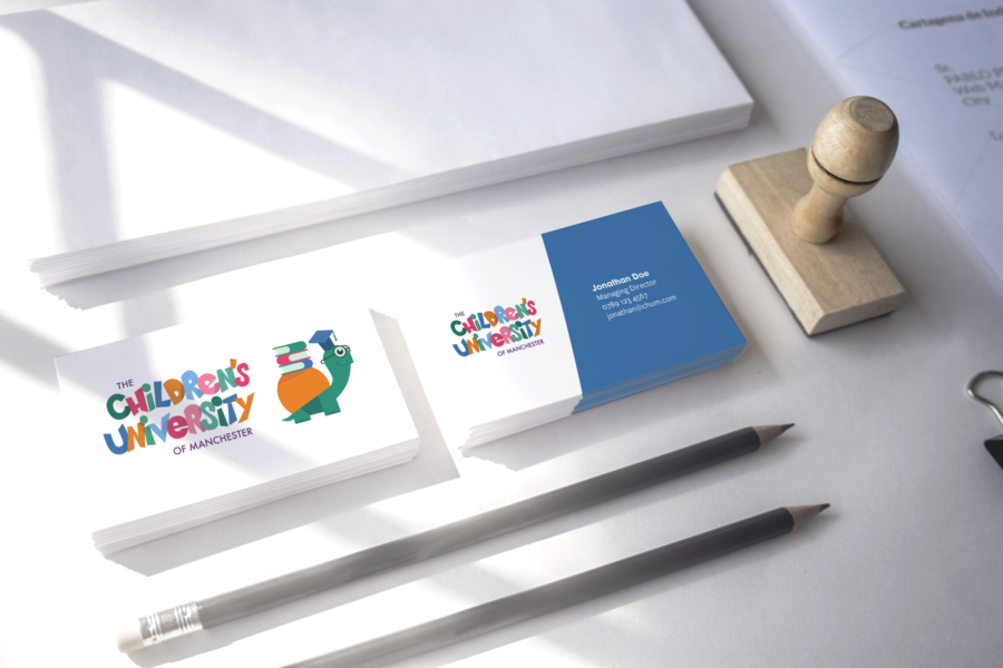
Crucially, we took a digital first approach, by creating a responsive logo. The full version contains the bespoke logotype and a delightful animated character. The logo adapts, depending on the digital user’s breakpoints, ensuring that the Children’s University of Manchester brand identity resonates clearly and effectively regardless of the user’s device.


